Hiển thị các bài đăng có nhãn Golden Age Illustration. Hiển thị tất cả bài đăng

Thứ Năm, 19 tháng 11, 2009

Abbey's Morgan Hall

Blog reader Susan Fox did some good sleuth work, and found the Broadway, U.K. home of American expatriate illustrator Edwin Austin Abbey.

"The house is called Morgan Hall," she writes. "It took a little asking around the village, but I found someone who remembered that Abbey the artist had lived here. I walked down the drive, took a deep breath and knocked on the door, but no one was home. The drapes were pulled and a I sneaked a peek at the beautifully furnished interior and grabbed a couple of photos of the outside. This was in 1993."

"As you will see, Illustration and painting seems to have paid pretty well for Abbey. It's quite a house. Classic Cotswolds stone country home. It's right off the village green on one of the roads out of town. As far as I have been able to figure out, this is where Sargent painted Carnation Lily, Lily Rose."

Thanks, Susan! See her work on Cafepress. Previous GJ post on Abbey.

Thứ Tư, 18 tháng 11, 2009

Howard Pyle Blog


Illustrator and collector Ian Schoenherr has just started a blog on Howard Pyle. He explains:

I avidly collect the work of Howard Pyle. But that's only a slender part of my Pylomania. I also seek out information - even seemingly meaningless or useless factoids - about his life, his family, his art school, his working and teaching methods, as well as copies of his correspondence, sketches, drawings, paintings, photographs, books, magazines, prints, ephemera and esoterica - pretty much any and every kind of tidbit that has something to do with Howard Pyle. So, to justify my existence and my obsession, I've start this blog to share some of what I've learned or accumulated.

The Howard Pyle blog.

Thứ Năm, 12 tháng 11, 2009

Dorne's Pragmatic Idealism

Here's Al Dorne, one of the founders of the Famous Artists School, and the illustrator with the most resplendent eyebrows.

His philosophy of teaching was a mix of pragmatism, idealism, and populism. "Commercial illustration means pictures you can understand," he said. He also believed the work of the illustrator was the highest possible calling. In the introduction to the Famous Artists Course, he said,
"As people divided into different tribes and developed their different dialects, art became more specifically and necessarily the one universal language. It was used to record events——to tell religious stories——basically to communicate ideas to all, regardless of their own spoken language. Today art is used commercially to convey definite messages to the people."

A large collection of Dorne's illustrations can be found (and downloaded) at Leif Peng's Flickr page on Dorne.

Thứ Năm, 5 tháng 11, 2009

Enchantment Symposium Tomorrow

Tomorrow the Joseloff Gallery of the University of Hartford in Connecticut will open the exhibition "Enchantment Then and Now: Drawing Connections."

The exhibition includes Briton Riviere (above), J.L. Gerome, William Bouguereau, Howard Pyle, NC Wyeth, Graydon Parrish, Walton Ford, and a selection of other contemporary painters whose work addresses the theme of enchantment, narrative, and romanticism.


Above: Howard Pyle, "Why Seek Ye the Living in the Place of the Dead?," 1905.

There will also be a panel discussion tomorrow, Friday, Nov. 6th, 1:30-3:00 p.m moderated by former Dahesh Museum director and current editor of Fine Art Connoisseur Peter Trippi. The panel includes Alison Moritsugu, Graydon Parrish, Patricia Watwood, the Director of the Dahesh Museum of Art, David Farmer, and me. The opening reception will be Friday from 5-7.
-------
Review of the exhibtion in the Hartford Courant.

Preview all the art in the exhibition at the Joseloff Gallery's Flickr Page.
Information about the symposium and the opening reception on Friday.

Chủ Nhật, 18 tháng 10, 2009

Rockwell and the Camera

Norman Rockwell went to great lengths to get his models to act. He spared no expense in hiring photographers to document their performances. The resulting photos—20,000 of which are in the Norman Rockwell Museum’s archives and have just been digitized—served as references for most of his famous Post covers after the mid-1930s.


As a new book and an upcoming exhibition demonstrates, Rockwell was always conscious of going well beyond the photo, striving for a exaggerated reality to communicate his ideas.

His painting “The Gossips,” 1948 (Oil on canvas, 33” x 31”) is a good example. The 30 heads in the painting pass along a piece of gossip about Mr. Rockwell himself, who confronts the source of the rumor in the last pairing.
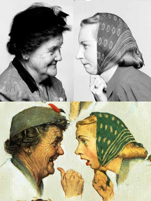
The old lady and the young woman with the scarf went through a big transformation from photo to painting. The older woman in the painting is seen more in profile; and her smile is broadened. The younger woman’s eyes and her mouth open wider and her head tilts more forward.

The man in this pairing gets a bigger shock of hair, a pointier nose, and a more wide-open mouth. His neck protrudes from a greatly simplified collar. The woman is brought more into profile, and she’s given a hand.

The man at left loses his hat, probably to avoid duplicating his counterpart. All his expressive features: eyes, eyebrows, and mouth are exaggerated—and he gets a hand with a cigar. The man at right, who appears just before the crescendo of the story, is pushed to the extreme. His chin tucks in, his hat tips to the side, he’s gets a bow tie, and his head takes the shape of a light bulb.

Rockwell also lifts his eyebrows. Hardly any model—except maybe Jim Carrey--can simultaneously drop the jaw, squint the eyes, and lift the eyebrows. It’s not easy; try it! But it looks right, and Rockwell got it in the final.

Rockwell always wrestled with his conscience over his use of the camera and the projector, which he called “an evil, inartistic, habit-forming, lazy, and vicious machine.”

But he should have been easier on himself, because he really set a good example to the rest of us about how to use photos intelligently. He rarely forgot his initial conception, and he only used the photos as a starting point.

As he said in his classic work “Rockwell on Rockwell,” 1949, “I feel that the characters which I produce in this way more nearly express those which I have in my mind and which I am trying to portray.”
------
More about new book Norman Rockwell Behind the Camera, by Ron Schick on Amazon.

The exhibition: Norman Rockwell Behind the Camera will run at the Norman Rockwell Museum from November 7 – May 31, 2010, link for more info.

There’s an article in this month’s Vanity Fair with lots of images and a surprisingly respectful biographical overview.

Thứ Sáu, 28 tháng 8, 2009

Twice Marooned

Harpers Magazine published Howard Pyle's first version of "Marooned" in 1887. The pirate is resigned to his fate, punished by abandonment on a tiny island, with nothing but his hat, a bottle of rum, and a rifle.

A wave crashes in the distance, and a second wave washes up in the foreground, making it clear that this a small piece of real estate.

Pyle came back to the idea in an easel painting from 1909, which wasn't reproduced until Henry Pitz's biography decades later. Pyle's fascination with composition shines through the refinements that he made more than thirty years after his first version.

He pushes everything to the extreme. The pirate's pose is simpler and smaller in the vast emptiness. His stuff is gathered at his feet rather than strewn across the beach. The far sea is only a sliver. A cloud of gulls flies high in the sky behind him, mocking him. His second version benefits from his lifetime of teaching and learning about storytelling composition.
----
More about the painting at "The Art of Storytelling."
See the original of the painted version, along with lots of other Pyles, at the Delaware Art Museum.

Chủ Nhật, 7 tháng 6, 2009

Style

Thanks for all the fascinating and helpful comments in yesterday's post about the subject of teachers drawing on top of student work.

To follow up and finish, here's a twelve panel cartoon called "Style," by A. B. Frost, published in Scribners in 1891. Note that the young artist asks the older artist to rework his piece, so he has only himself to blame for the calamatous result. (Click to enlarge.)


Thứ Ba, 2 tháng 6, 2009

Catcher in the Rye Cover

The reclusive author J.D. Salinger is in the news today. He's suing to block the publication of an unauthorized sequel to his 1951 novel The Catcher in the Rye.

Many of us remember the novel from its plain red cover (right). But its first paperback edition went through 27 printings with a cover by James Avati. Salinger was against showing Holden Caulfield on the cover of the book.

After some tense meetings, Avati won over the editors, arguing:
"Mr. Salinger felt that since he had not described Holden in physical detail his face sould not appear on the cover. We always had that problem. It is, in fact, quite frequently the core of our cover thinking, to the extent that it is the resolution of personality as expressed by some graphic device that makes up the cover. We try to find a way of conveying the mood of the book rather than describing some particular scene. Within reasonable limits it has proved true that physical characteristics are of much less importance than reactions expressed."

Which cover do you prefer? Please vote in the poll. (Added later: The plain red cover won 87 percent of the voting with 178 votes, compared with 25 votes for the Avati cover.)

More about the Salinger lawsuit, link.
Quote from "The Paperback Art of James Avati" by Piet Schreuders, link.

Thứ Năm, 28 tháng 5, 2009

Pyle on Light and Shadow

Today we continue looking at Koerner's notes from Howard Pyle.


LIGHT


All things in sunlight are lighter than white in shadow. (See GurneyJourney post on this subject, link.)

A picture is more articulate where the light is concentrated on certain part rather than on all of it.

In a diffuse light everything is soft and close in tone.

Treat lamplight similar to sunlight, only shadows are denser.


SHADOW

Keep your shadows the same strength.

If you face strong sunlight in a picture your color is in your shadows.

In painting anything, don’t get different qualities in your shadow.

After picture is right in tone, finish up by studying edges and keep your shadows out of the light.

If two or more figures are together you can bind them together by running a shadow of same strength from one to the other.
-------
Images from the Atheneum, link.

Thứ Tư, 27 tháng 5, 2009

Pyle on Tone and Edges

Many of you have asked for more classical art teachings from obscure primary sources. So today and tomorrow, I’d like to share some rare nuggets from Howard Pyle.

Mr. Pyle didn’t write down a lot of theories because he was suspicious about systems or formulas. He believed that pictures were made by inspiration, not by analysis. “The student learns rules,” he said. "But all the rules in the world never make a picture.”

Fortunately he did speak about his ideas of picturemaking during class sessions at the Brandywine school. Several of his students wrote down what he said. One good set of notes comes from W.H.D. Koerner, who became a notable illustrator of western subjects.

TONE

Keep your picture simple in tone. The fewer the tones the simpler and better your picture. The more tones in a picture the harder [it is] to do.

If a face against the light seems dark, it sometimes can be lightened by darkening the hair or hat.

If you feel your white isn’t light enough, make it still lighter.

Keep pretty much same tone quality in flesh and white cloth except in the shadows.

A white coat in a room must be a trifle darker than your white light out of doors.

Forget your drawing and stick to tone. If you get balled up on a part of picture, go back to the tone and don’t rely on drawing.


EDGES

The study of edges is the main thing, outside of tones.

One way to get a spiritual feeling in a certain figure [is to] keep everything softer in that figure than in other parts of picture and let light radiate away from it.

Tomorrow we’ll look at Koerner’s notes from Pyle regarding light and shadow.

Thứ Tư, 20 tháng 5, 2009

Drawing from Memory, Part 1

N.C. Wyeth once said: “Every illustration or painting that I have made in the last thirty years has been done from the imagination or the memory.”

Wyeth quoted a teacher of his, Charles Reed of Boston in advising him: “the faculty of memory has become a lost function among American artists. He (Reed) blamed much of the lack of mood and imagination in their work to this fact.”

American illustrator John Gannam was also a great believer in memory training. He took six months off his busy illustration career to study from nature. But he preferred to observe a scene, jot down written notes or describe it to a friend, and then paint it back in the studio from memory. Gannam claimed “that observation is more searching when it is acting for the memory than when used for immediate transcription.”

In a sense, every observational drawing is a memory drawing. Even when you’re looking at a model, you have to look for some fact and remember it for a split second while you reconstruct that fact on the drawing.

Some subjects require that the observer hold an image a little longer in memory. Moving animals, ocean waves, or sporting events change so fast that you have to study the action in the fleeting moment. Moonlight scenes are usually painted from memory just because in such limited light, accurate color judgments are impossible.

Tomorrow I’ll give you a fun exercise to test your observational memory.

Memory Series
Part 1: Art and Memory
Part 2: Memory Game
Part 3: Remembering a Face

Thứ Bảy, 16 tháng 5, 2009

Tangencies

A tangency is a point of contact between one shape and another so that they just touch without overlapping. A tangency can also happen when a shape touches the frame of the composition.

This picture by Howard Pyle is full of tangencies:
1. The pirate’s hat with the top of the picture
2. The ship with the shore
3. The chin of the far pirate with the dark hillock
4. The tip of the sash with the head of the digger
5. The tip of the shovel with the frame
6. The head of the kneeling man with the digger’s elbow
7. And the stock of the rifle with the man’s head.

Tangencies cancel out the illusion of depth. They reinforce the flatness of a picture. They’re often regarded as a common beginner’s mistake.

So why did Pyle use them? He was a master of composition and he usually knew exactly what he was doing. The idea of deliberately flattening a picture was very much in vogue at the time Pyle did this picture. His pen and ink works were influenced by Walter Crane and Aubrey Beardsley’s decorative approach to line. Pyle must have wanted the piece to be flat like a playing card.

Do the tangencies help this particular picture? As much as I admire Pyle, in my opinion, they don’t here. They call attention to themselves and get in the way of the larger ideas of story, characters, or mood.

Thứ Năm, 14 tháng 5, 2009

Multitasking

Howard Pyle provides probably the ultimate example of multitasking while painting.


One of his students, Thornton Oakley, recalls:

On the stairway landing I found my teacher at his easel, working on a canvas for his series “Travels of the Soul,” his young children cavorting about his knees, a model posed nearby in costume to give him some detail of texture, Mrs. Pyle sitting beside him reading aloud proofs from King Arthur for his correction, he making comments for his notation.”


That kind of brainpower is a remarkable achievement, way beyond me, that’s for sure. But I find that while my mind is engaged in painting, there are chunks of grey matter sitting around idle. Engaging those areas with non-visual tasks makes me paint more intuitively, which helps.

You all offered some great comments on an earlier post about listening to music or books on tape. When it comes to enjoying the company of young children or pets, I’m in agreement with Pyle. When my kids were young, there was always a lot of commotion going on in the studio, and it strangely helped my concentration.

Thứ Ba, 12 tháng 5, 2009

Revell’s Rembrandt

Jack Leynnwood was the Rembrandt of Revell plastic model boxes.
Leynnwood was a teacher at Art Center, where I went to school, but I don’t think the school administration valued him enough at the time. In my day, the only place he taught gouache painting was at off-campus seminars, where I had the privilege of watching him paint a demo of a red car.

In 1965, the Revell company turned to Leynnwood to paint the box cover for their model of the Army Air Force B-24D.

When Revell switched to using photos instead of paintings on their boxes, I lost interest in plastic models. I didn’t want truth in advertising. I wasn’t just buying a box of plastic parts. I was buying the whole fantasy. And no one understood how to deliver that fantasy that better than Jack Leynnwood.

Read more about this painting and the aircraft shown at The Box Art Den, link.

Thứ Sáu, 10 tháng 4, 2009

Lovell's Soldier

When American illustrator Tom Lovell (1909-1997) painted the standing soldier for The Continental Insurance Company, he researched the weapons and costume at a museum and did a charcoal study from a nude figure to understand the pose. The studies appear surrounding the finished illustration in this page from an article in North Light Magazine.

Here's how Lovell himself described the process:
The requirement here was to create an heroic, slightly larger than life embodiment of a man who could be identified with dependability and authenticity and at the same time be real. This was done to replace the original trademark figure used for many years by the Continental Insurance Company.

Before consulting a model, I drew this basically strong figure, to be certain he would not be overpowered by his equipment. Research in depth was done at West Point Museum under the guidance of Col. Frederck P. Todd, then curator. The painting later won a gold medal at the Society of Illustrators Annual National Show.

---------
Image is trademark of the Continental Life Insurance Companies.

Leif Peng's excellent illustration art blog "Today's Inspiration" has been doing a feature this week on Lovell , drawing from the 1956 American Artist profile by Norman Kent.

The material in this post was drawn an article "Tom, The Unswervable Lovell," in the North Light Collection, Volume 2, 1979, a compilation from the North Light Magazine.

Lines and Colors tribute to Lovell, link.

Chủ Nhật, 5 tháng 4, 2009

Edwin Austin Abbey


I've been a bit out of reach from the Internet, so let me just offer a picture by one of my favorite overlooked masters, Edwin Austin Abbey. Abbey was an American expatriate artist famous for his pen and ink illlustrations, his murals at the Boston Public Library and the Harrisburg, PA capitol, and also for his unsurpassed illustrations from the plays of Shakespeare.

He was good friends with Lawrence Alma Tadema and John Singer Sargent, who taught him to paint after age 40. It helps to have teachers like that! The painting is called "Fair is My Love," from 1900.
------
Lines and Colors post about Abbey, Link.
Bio on Butler Art, link.
Ciudad de la Pintura, Link.

Thứ Tư, 25 tháng 3, 2009

Love Story

The Arkell Museum in Canajoharie, New York is currently presenting an exhibition exploring the history of romance illustration.

The Arkell Museum recently built a modern new addition with plenty of space for their permanent collection of Homer, Dewing, Inness, and even a full-size copy of Rembrandt’s Night Watch. Now they have ample space for special and traveling exhibitions.

The “Love Story” show, on view through May 3, contains 53 original illustrations borrowed from the New Britain Museum of American Art.

The artwork illustrated amorous stories from the books and magazines published during the Golden Age of illustration. Many of the great illustrators are represented: James Montgomery Flagg, Harvey Dunn, Dean Cornwell, Henry Raleigh, Coby Whitmore, Al Parker, Pruett Carter (shown above), and Alice Barber Stephens.

Arkell’s curator Diane Forsberg explained the changes in social history reflected by the artwork. “The goal was for women to get married and stay married, no matter what,” she said, “and it stayed that way” even into the 60s and 70s when the final works were created.

Guest curator Martha Hoppin observed, “about half the works shown here accompanied stories about troubled marriages.” But they all had happy endings. The advent of television soap operas undercut the demand for illustrated women’s magazines and most of the illustrators found work in paperbacks or other places.

The guard told us, “People come in here and they spend a lot of time looking at the art.”

Arkell Museum, link.

Thứ Năm, 5 tháng 2, 2009

Rockwell Center for American Visual Studies


The Norman Rockwell Museum in Stockbridge, Massachusetts has just announced the formation of the Rockwell Center for American Visual Studies, a reseach institution devoted to the study of the history of American Illustration.

Art Info
reports that the Center will "provide stipends to scholars exploring illustration art, house a database of illustration-related materials, establish a network of like-minded institutions to share information about artists, and develop a collection of illustration art of the past 150 years."

Joyce Schiller, who served for seven years at the Delaware Art Museum as curator of American art, was named the Center's first curator. She said,
“The formation of the Rockwell Center is an exciting and extremely important development within the field of illustration art. The art of illustration has informed America’s visual culture throughout the country’s history. It’s essential to bolster research in the field, as well as preserve these fragile works of art—these cultural snapshots—for future study and appreciation."

Rockwell Museum press release, link.
Art Daily article, link.
-------
Photo of the museum courtesy T.S. Amarasiriwardena /Boston.com

Thứ Tư, 7 tháng 1, 2009

Rearranging Art Books

Today I rearranged the art books in my home library.


Before this, I had the monographs segregated in separate sections, the way they do in bookstores and libraries. There was one section for illustrators and another for 19th Century European artists and another old masters and another for children’s book artists.

But I had a feeling that all of my artist heroes would have enjoyed each other’s company if they were sitting together in the same pub. So why not put the books together under one alphabetical listing? They're also much easier to find this way.

Now Hals is rubbing shoulders with Homer, Rockwell is sitting next to Sargent, and Shepard is consorting with Sorolla. I wish I could hear what they’re talking to each other about.

Thứ Tư, 19 tháng 11, 2008

Pyle Study


Here’s a small gray wash drawing of a costumed model by Howard Pyle. According to illustration historian Walt Reed, this was probably not a preliminary study for an illustration, but rather a drawing exercise or a demonstration for his students. Howevery, if anyone knows of a finished illustration related to this study, please let me know.